2021 Interface Mockup: Atlas Theme Design
UI/UX Design, App design, Interface Design

Retelling the tale of our tiger
A project in 2021 that made me fall in love with design. :)
A tiger situation
Wallpaper and themes on the Proton X50, Iriz, & Persona, infotainment head unit (IHU) are dull and outdated. Users (especially young adults) are requesting for newer look & feel theme outlook to be applied on their IHU.
Researching and Analysis
To understand how best to elevate the visual and functional aspects of the brand, I began by reviewing bridal industry competitors and analyzing user behavior on the site. I studied how visitors interacted with content, where engagement decreased, and what types of visuals held attention. I also worked closely with the team to understand the brand’s emotional tone; romantic, soft, and timeless and translated that into a visual system. Inspiration was drawn from bridal colour palettes, editorial magazine layouts, and modern wedding mood boards.
Goals
The ATLAS theme should consider the users’ ease in mind. The design needs to be clear, concise, easy on the eye, and modern. Target demographic age: 18-40yrs old
Clear-able to tell purpose and function of each design
Concise-focusing on clarity
Easy on the eye-making sure that the theme design catches the attention of target audience
Modern-able to show application of storytelling to a product.
The rebirth process
Concept: Is drawn by inspiration of the by the evolution of the PROTON logo throughout the years.
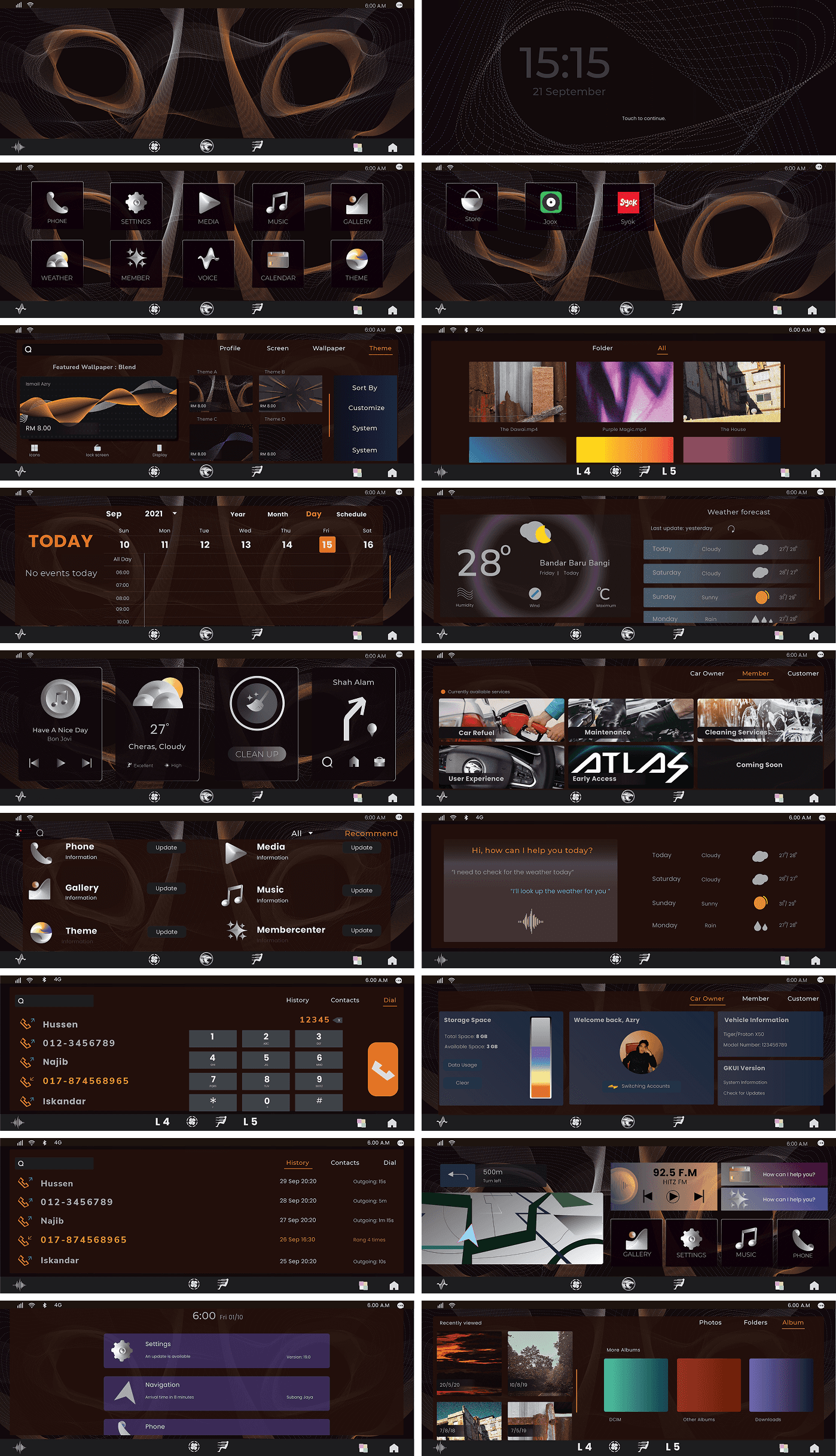
Adding to the heritage of the design is the crowning achievement of Malaysians in automotive, sports, science, art and many more. The tiger serves as a ‘DNA’ of Malaysians, being ever present as a metaphor of unity and strength.
Concept Storytelling
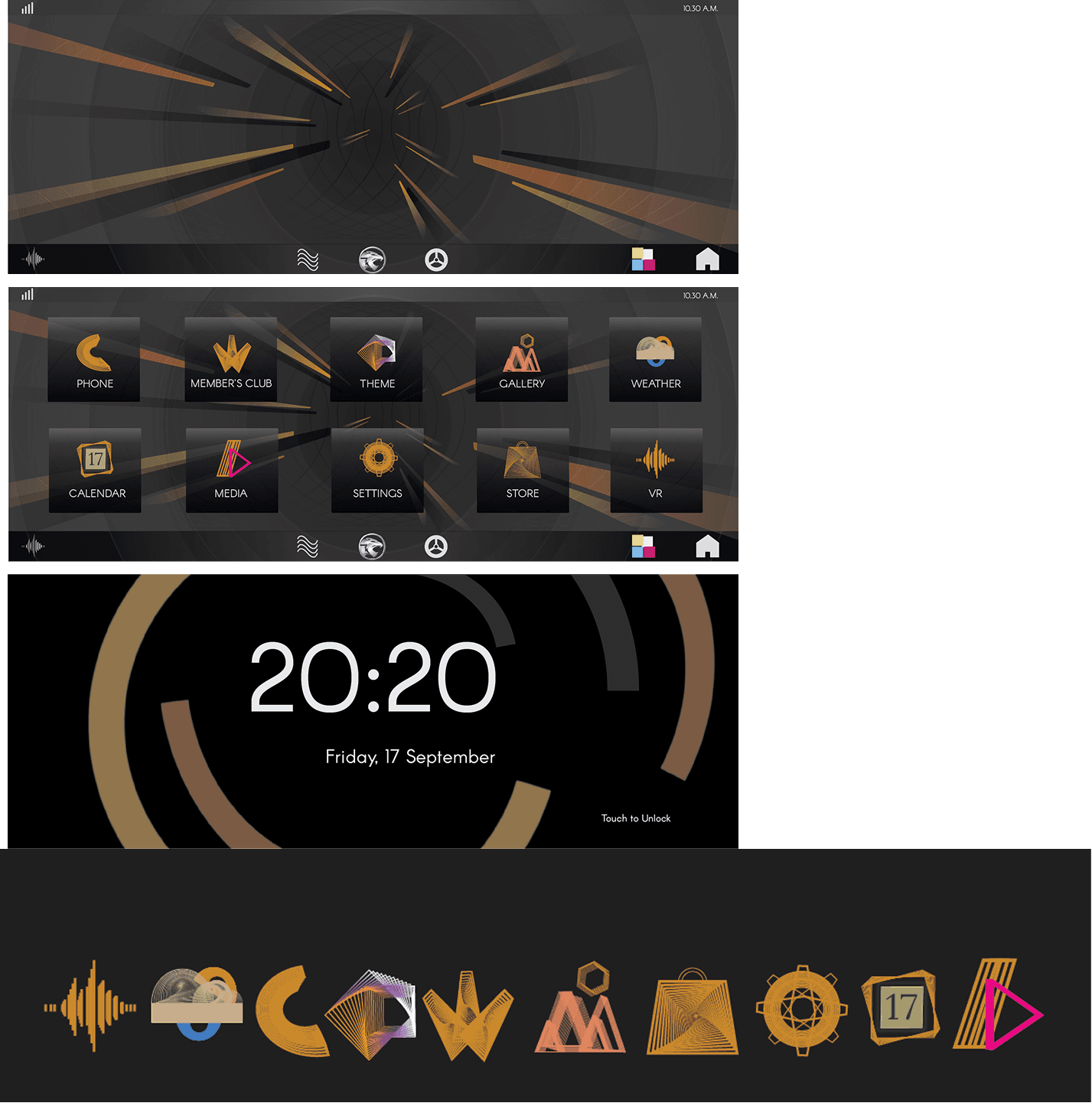
The Tiger enters the new digital age and ‘transforms by entering the interface. Each line represents a part of the tiger, identified by the colours as it blends itself with the new environment. The icon design has a geometric theme to it, valuing the strength of the Tiger.
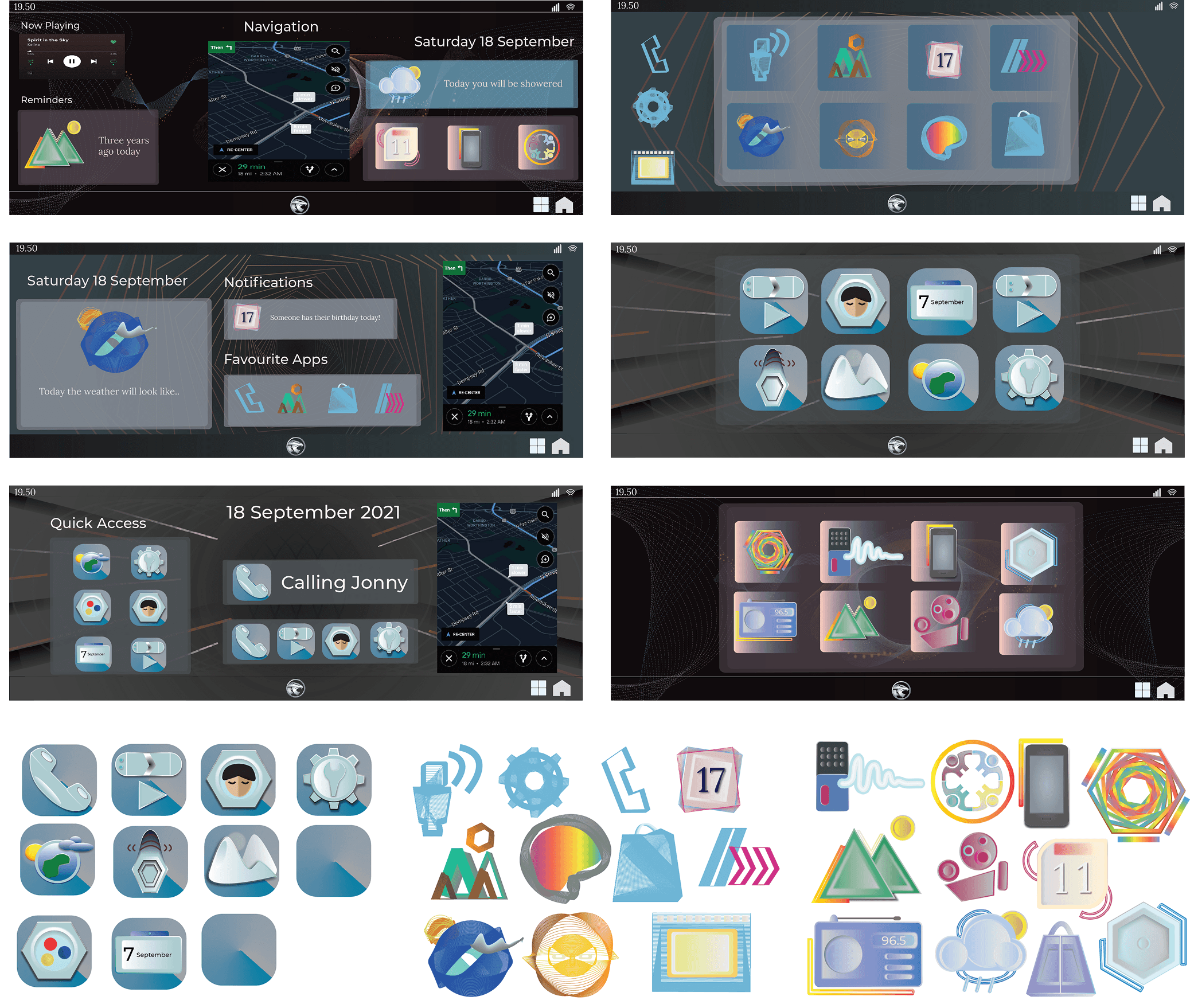
After some time, the essence of the Tiger forms a more cohesive connection, with the lines becoming more abstract and appearing more like a DNA sequence. The icon designs have more abstract design than the previous version. Additional pages for music, navigation, weather, contact, user profile, store, menu, gallery, notification menu was added to the concept.
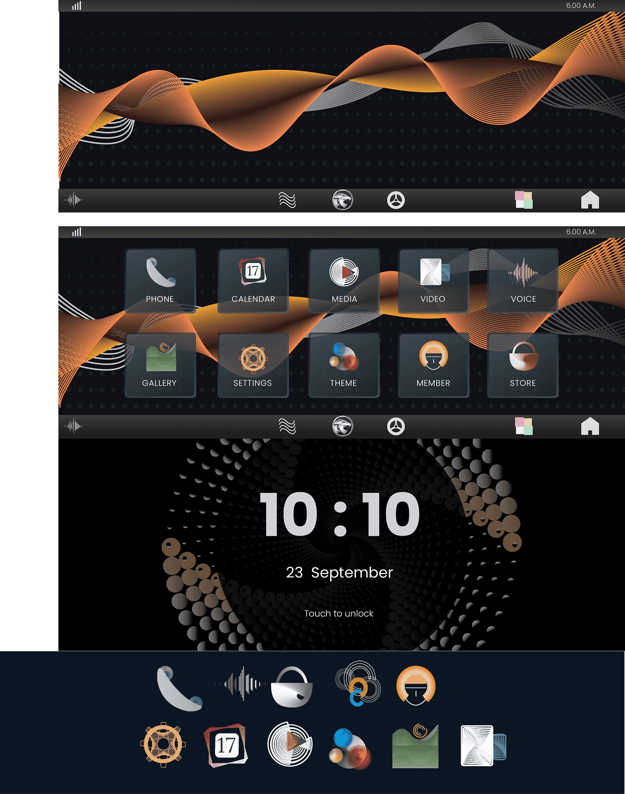
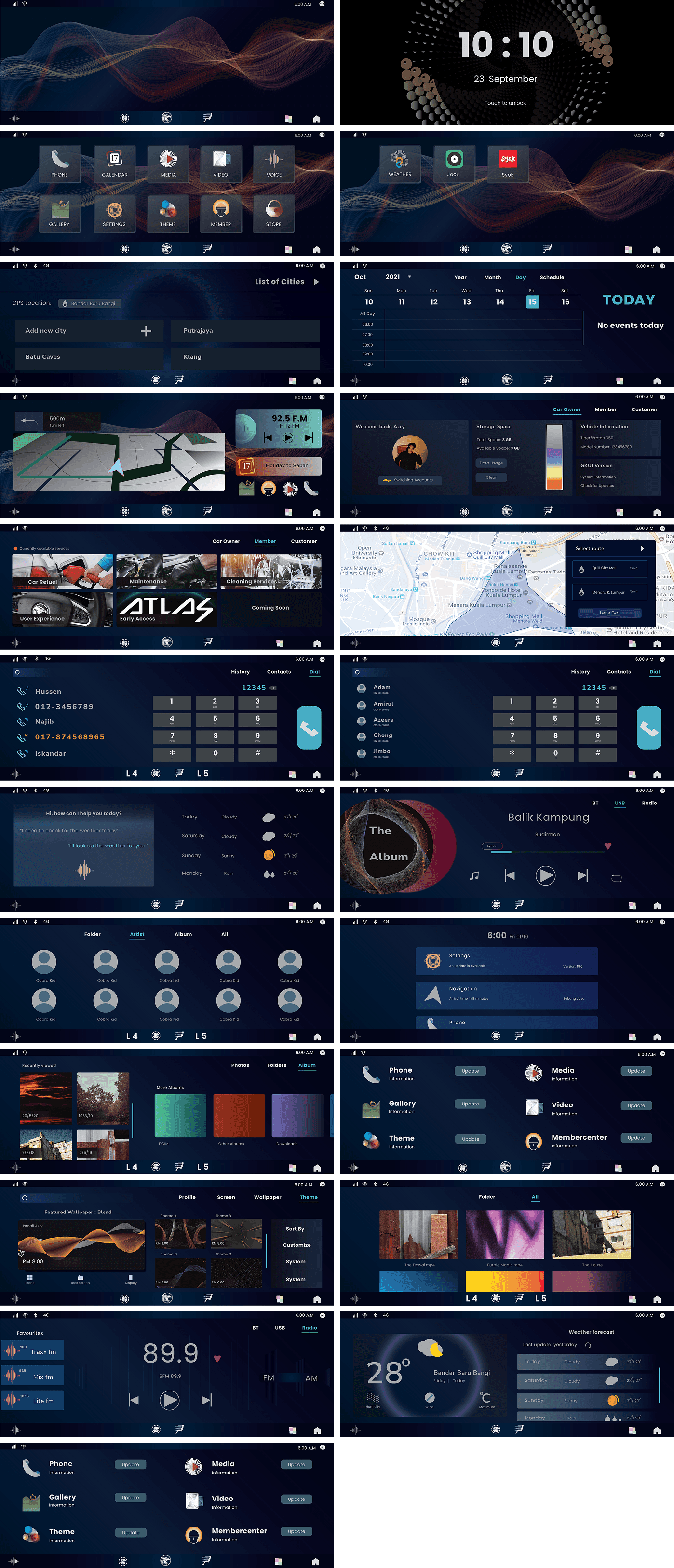
Final Design
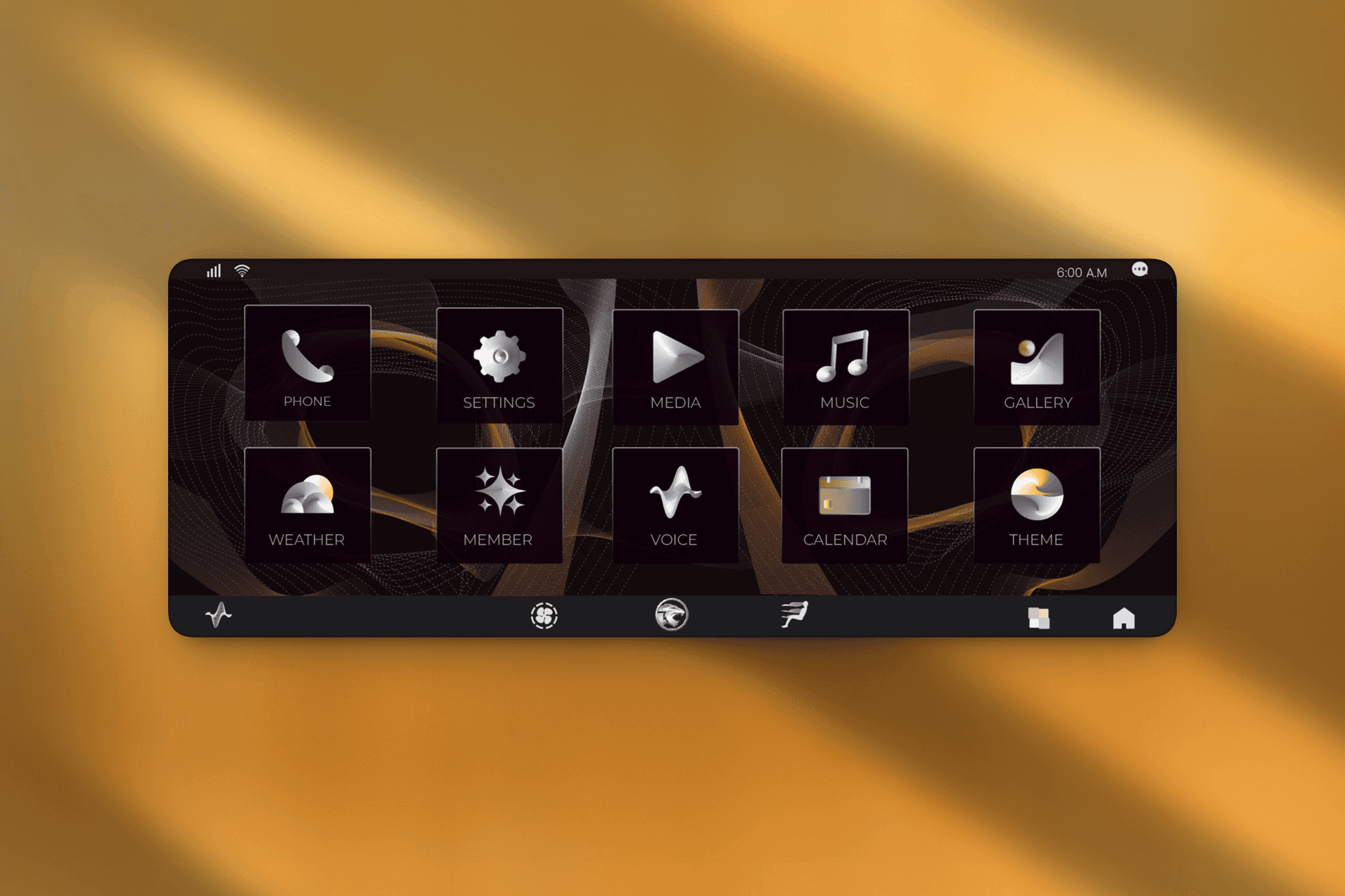
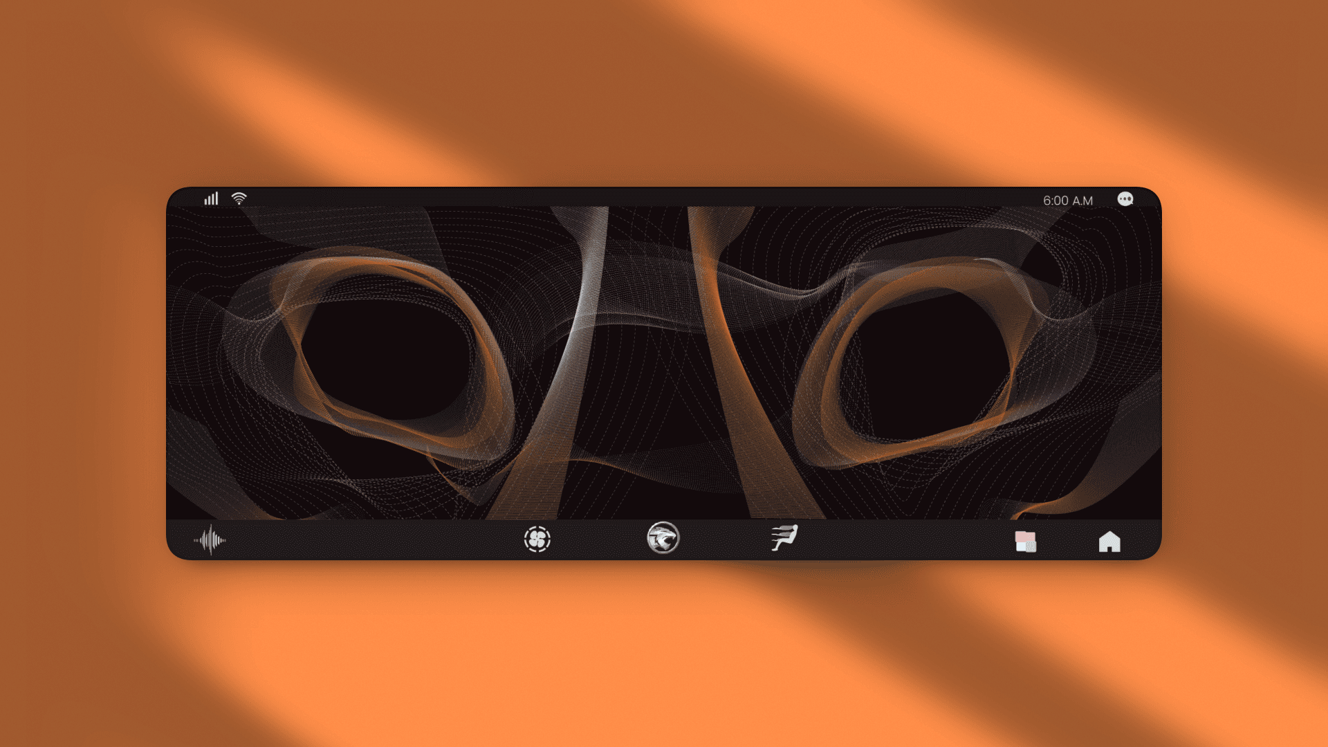
The DNA fully emerges as a re-imagined modern Tiger ready for the digital age. The design features a sleek silhouette with the Tiger’s features and distinct colours.
Icon Design
The imagery communicates romance, elegance, and timelessness. It’s designed to build emotional resonance with the target audience (couples planning weddings), while staying cohesive with the brand’s premium positioning.