Website development for PLANETSTEWARDS
Strategy, Product UI, Branding, Website development

A stewards journey : PLANETSTEWARDS
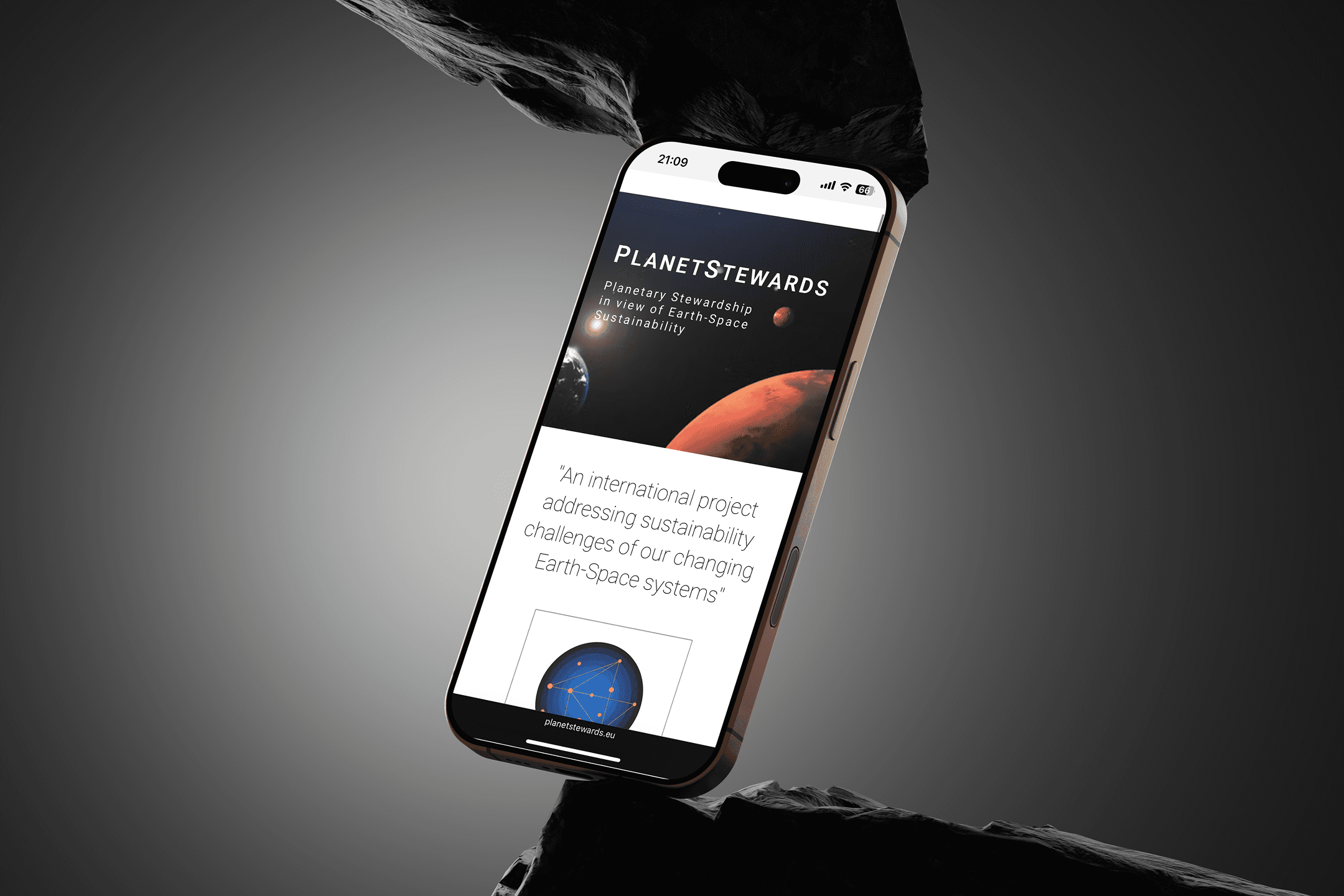
Imagine a classroom for and every lesson leads to action. PLANETSTEWARDS began as an initiative to address the need for Earth-space sustainability across Europe, turning into stewards for the Earth.
As a digital designer, I was entrusted to bring this mission to life online and to build a platform that not only informed, but inspired. The challenge? Create a visual experience that bridges education, action, and joy. The site needed to feel hopeful, accessible, and rooted in community, with space for educators, young learners, and green dreamers alike.
The project

The initiative needed a fresh and engaging online presence to appeal to younger audiences while maintaining credibility with institutional partners.
It required a brand identity that was friendly, optimistic, and educational without feeling overly corporate or too casual.
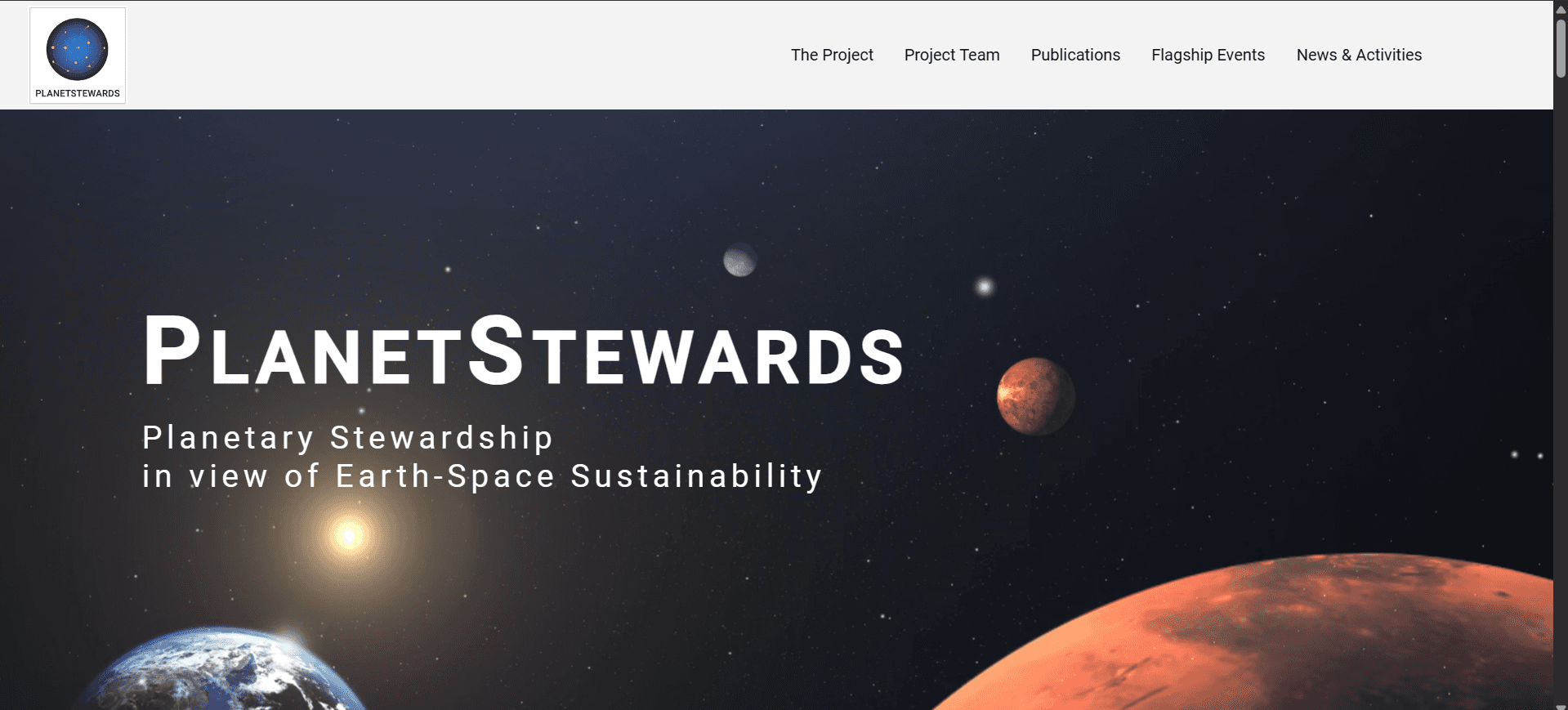
On a design perspective we were asked to make a clean and white aesthetic, which contrasts with the idea of how outer space is perceived.
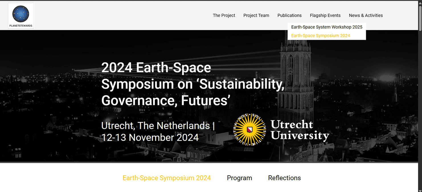
Collect registrations for symposium abstracts.
Research
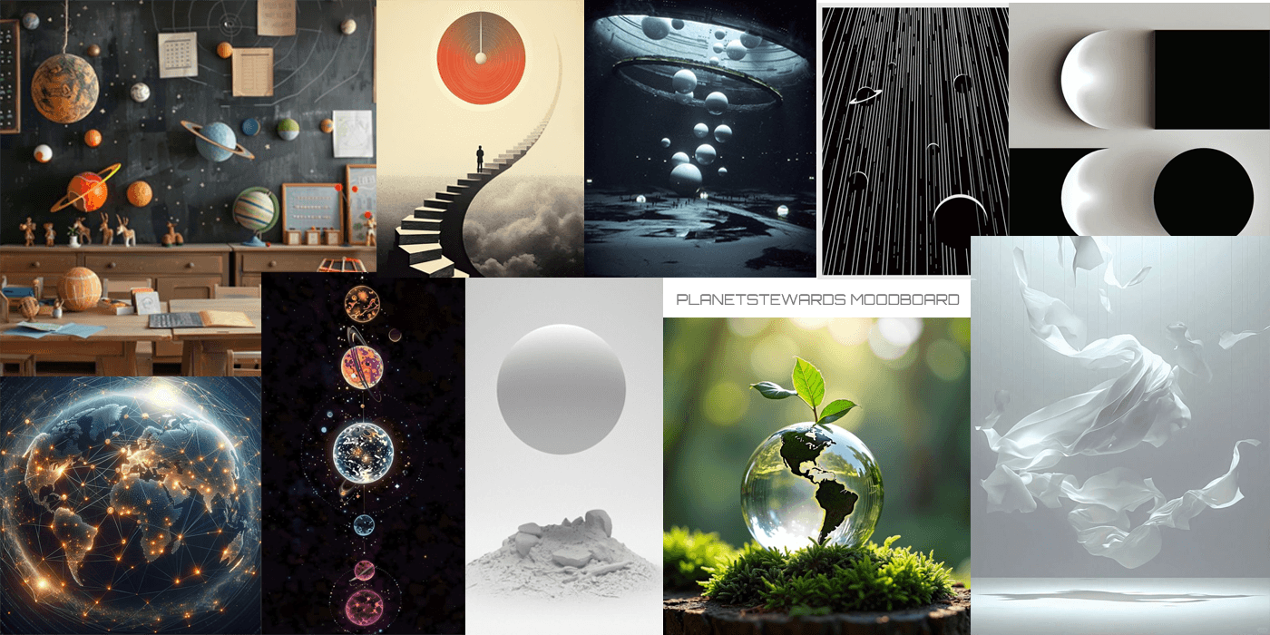
We reviewed environmental and educational non-profit websites and space institutions to study how they communicate purpose and trust. I explored colour psychology, youth-oriented design cues, and how to visualize themes of nature, science, and community. This informed the visual choices across branding and site layout.
Goals
To create a digital identity that is:
Approachable yet professional, resonating with both youth and educators
Nature-inspired with clean visuals, rounded edges, and earthy tones
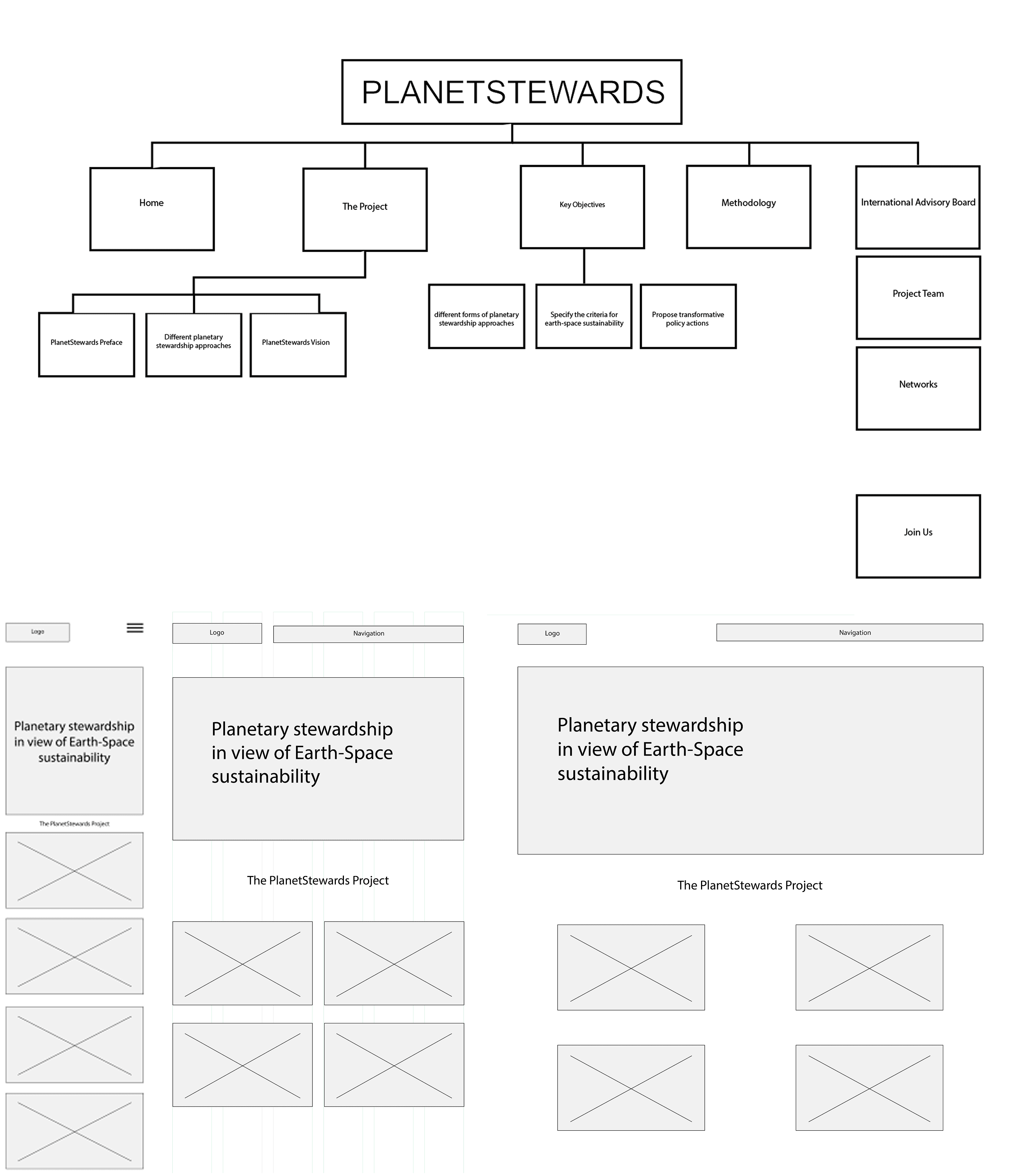
Visually organized to guide users through resources, activities, and calls to action
Magic in space
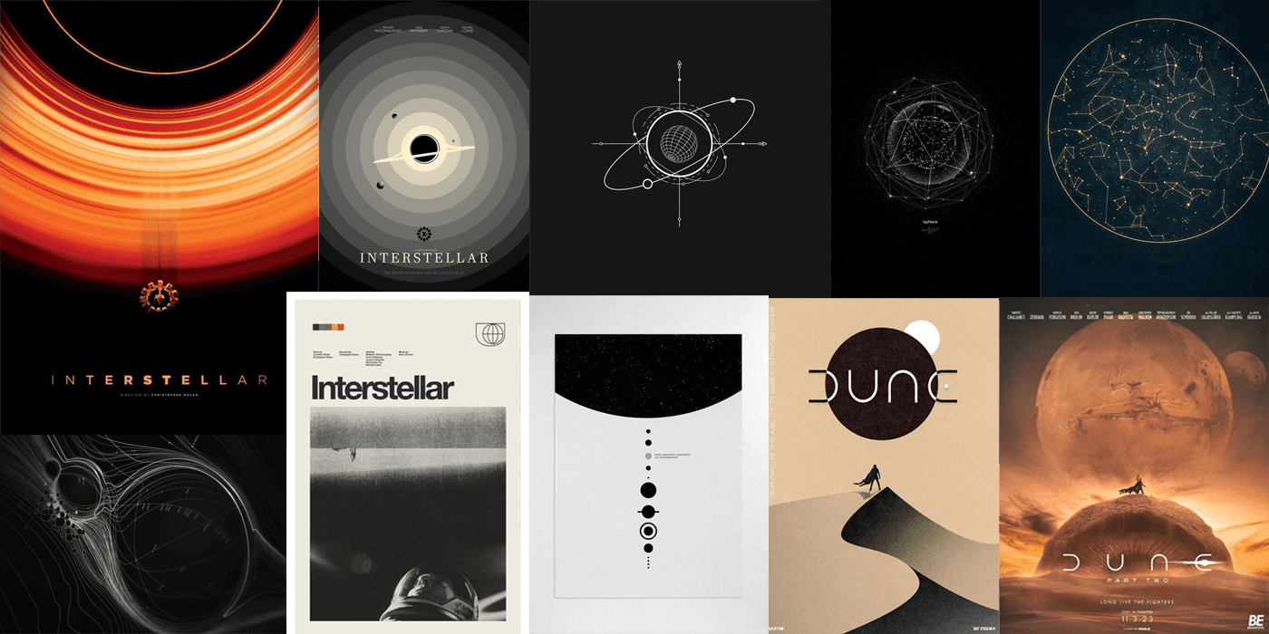
Designing for PLANETSTEWARDS called for a balance of clarity and conviction. It was quite the experience to translate outer space as white, as such was the task at hand. Inspired by Interstellar and Dune with the surrounding concepts that can fully deliver an immersive experience for the target audience. The aesthetic should be pleasing while maintaining the seriousness of the theme of the project.
Ideation
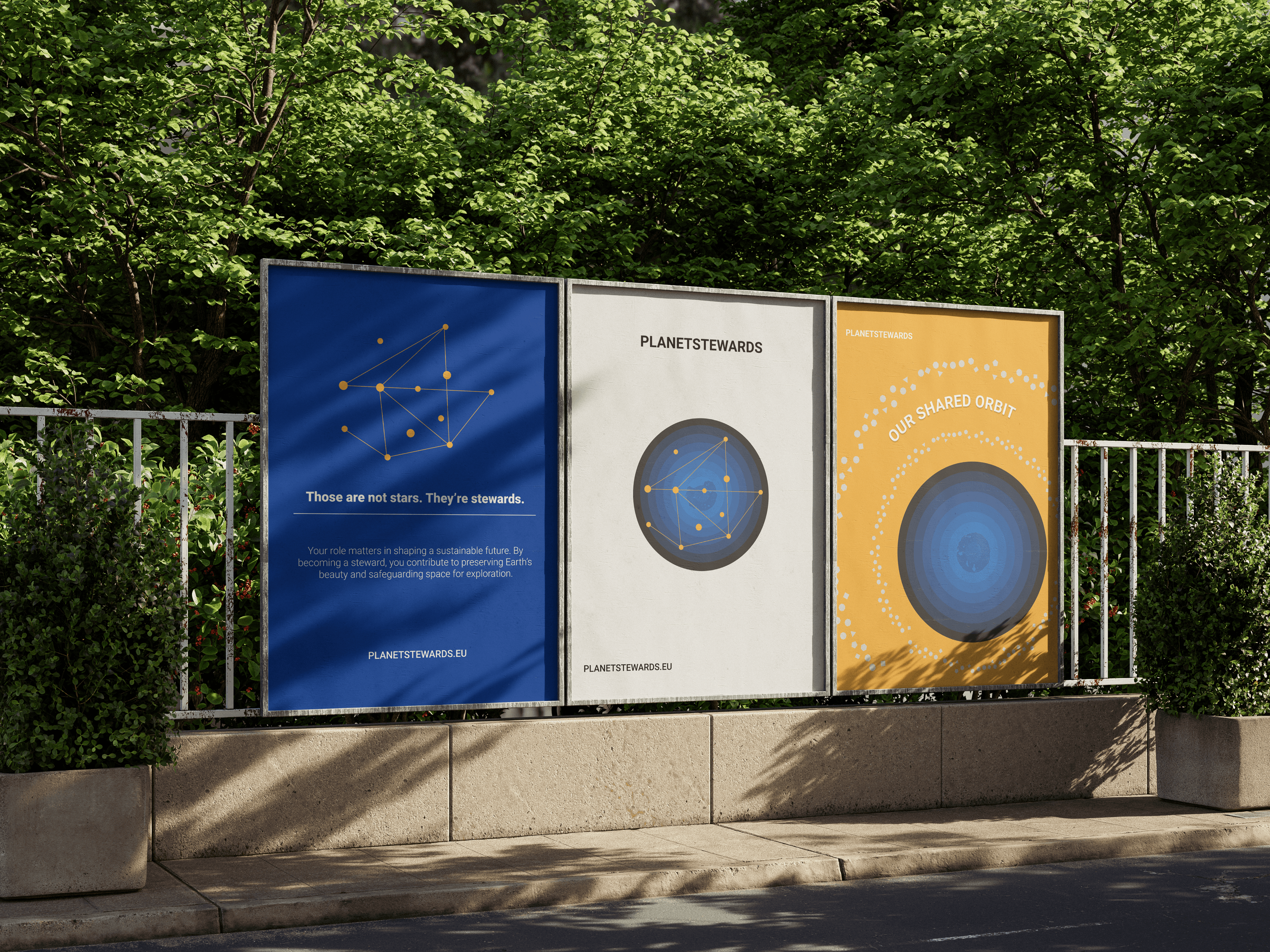
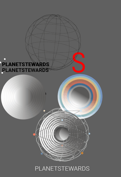
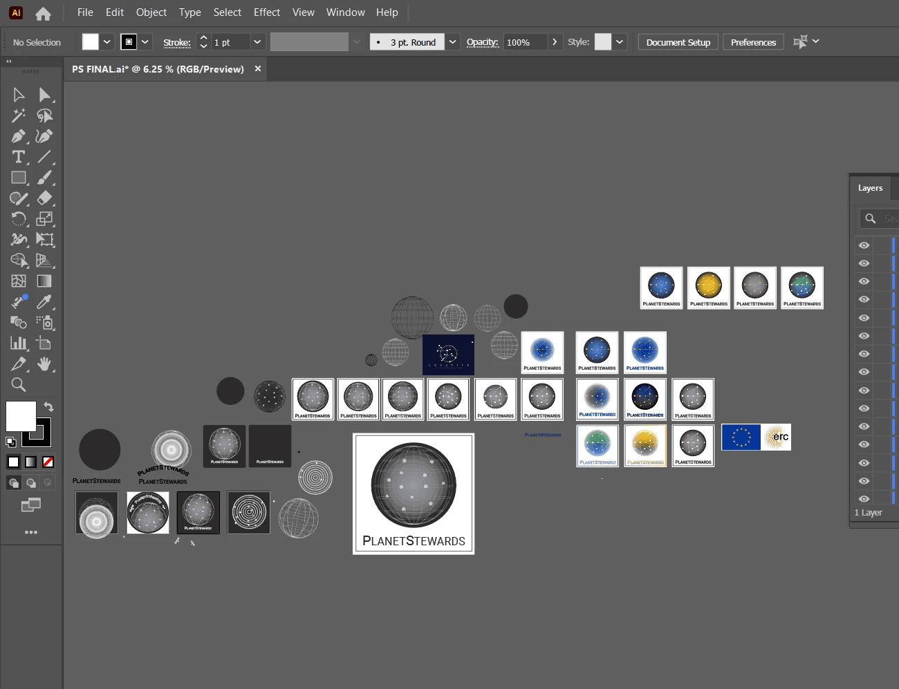
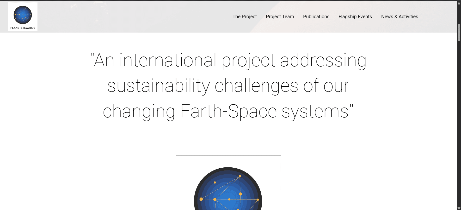
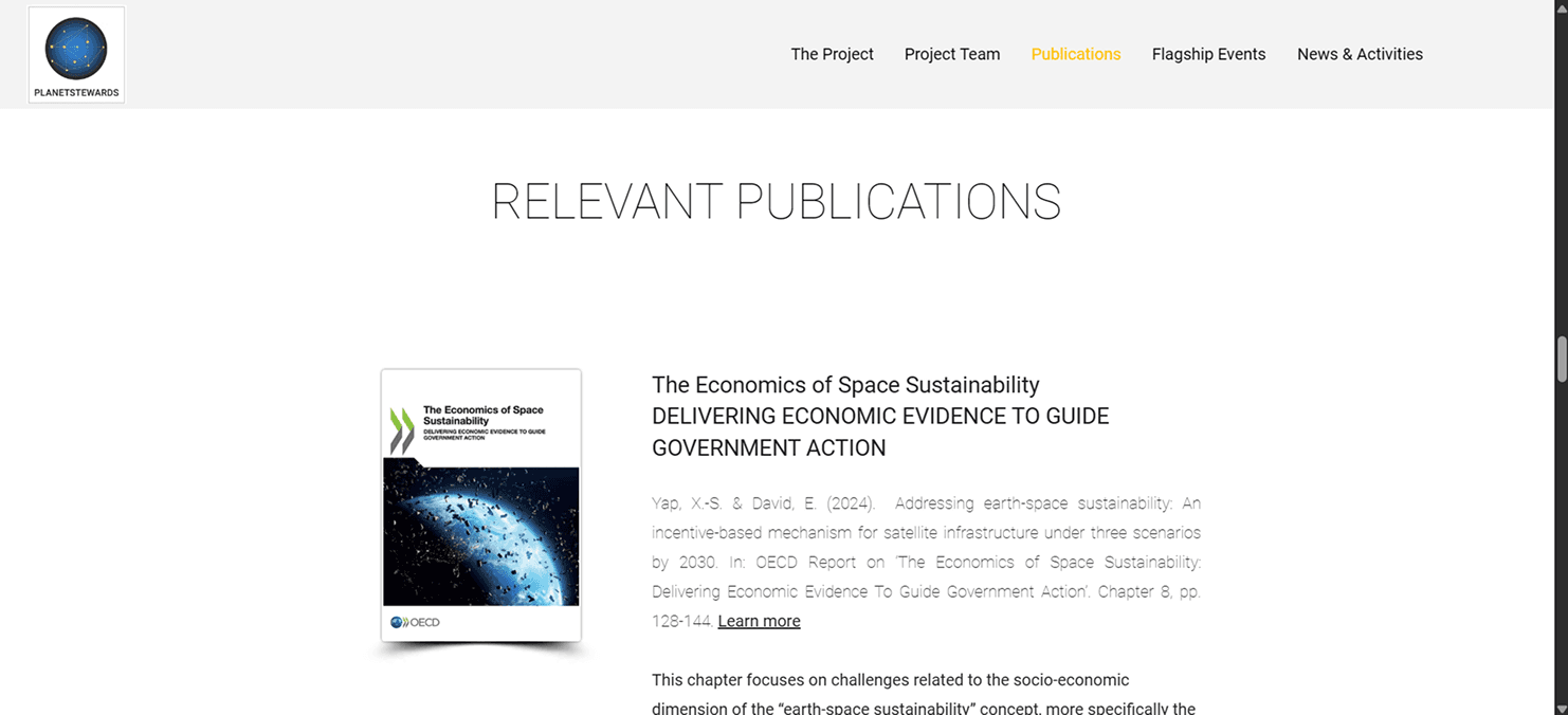
I contributed to early moodboards and logo concepts, focusing on organic shapes, earth tones, and friendly typography. The logo developed features rounded lines and abstract natural elements to reflect harmony and inclusivity. For the website, I helped with visual hierarchy, image placements, and icon styling to ensure clarity and consistency across different sections.


Designing for beyond Earth
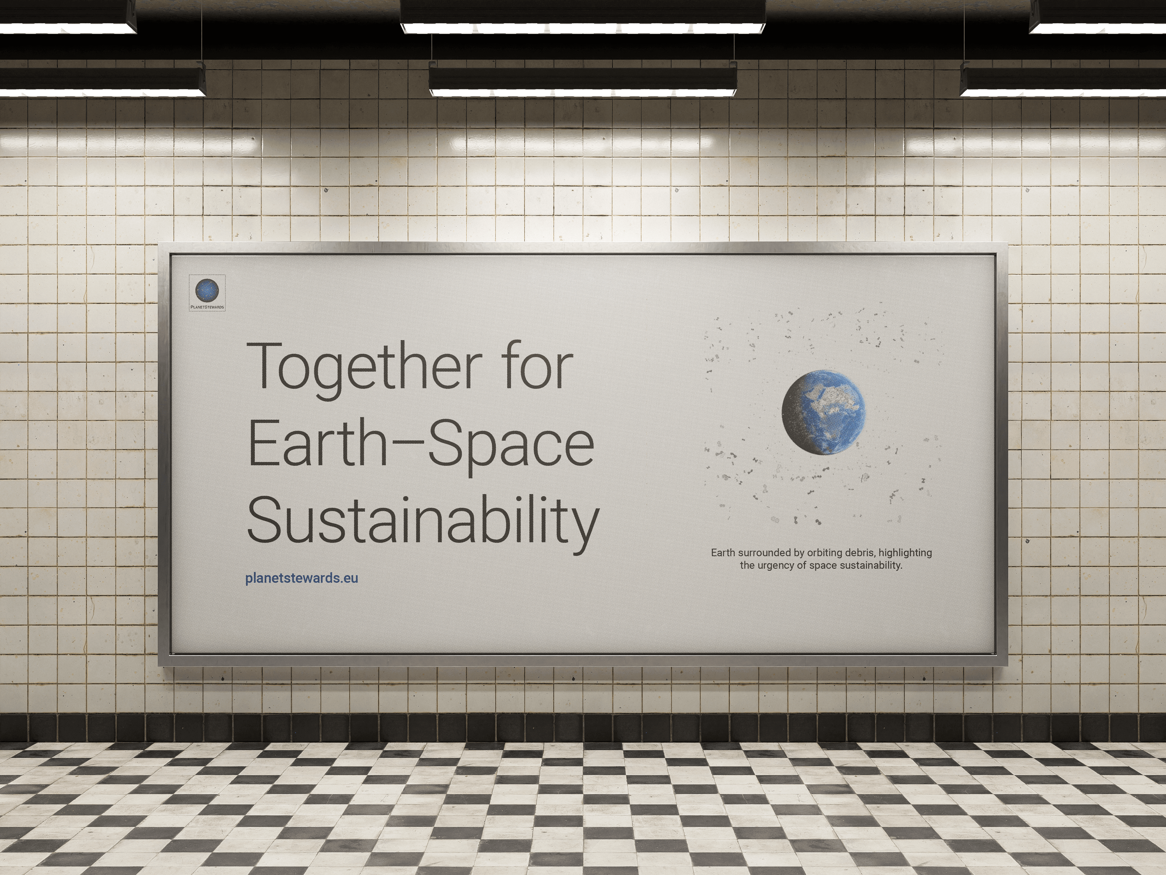
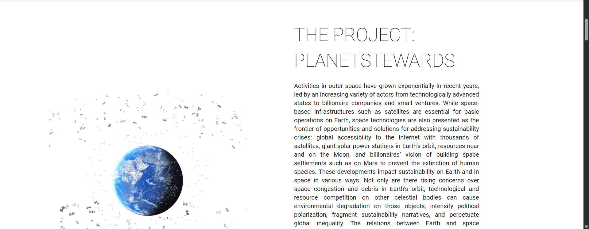
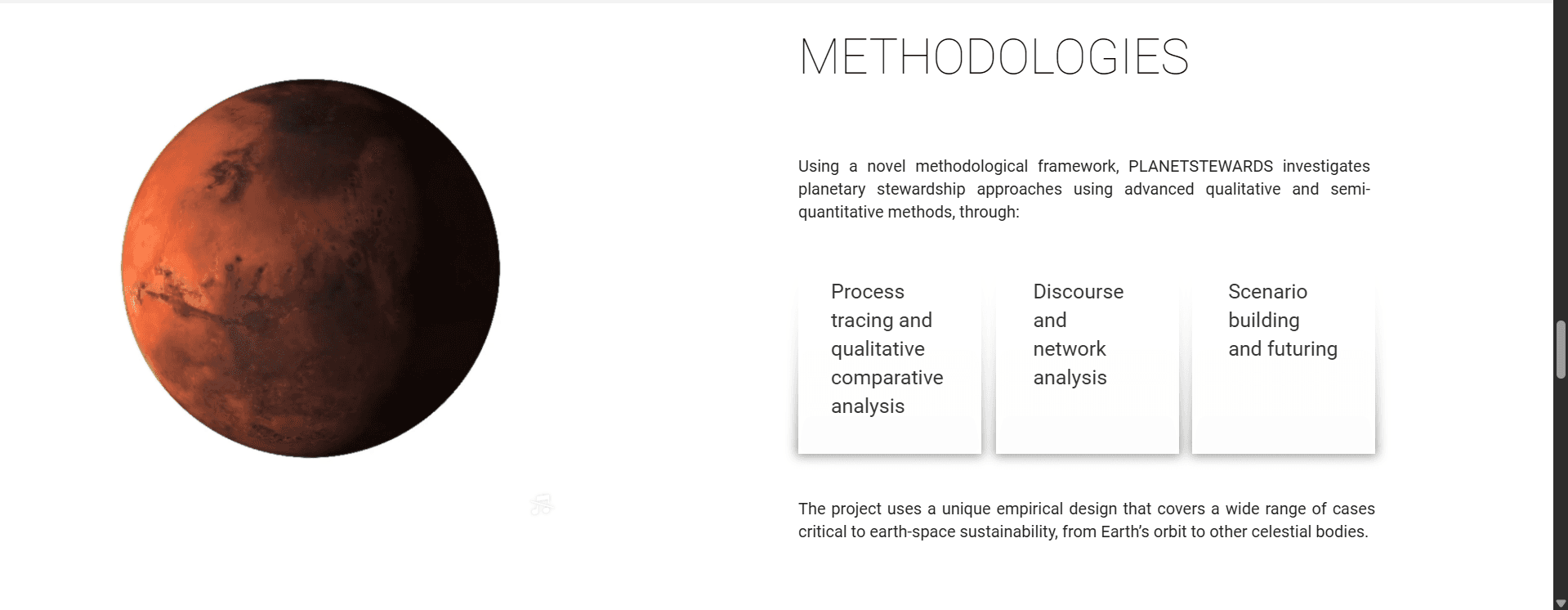
To highlight the impact of space debris to Earth's atmosphere, I designed a visual of such debris orbiting around Earth. The intention of this design is create an emotional impact by making the visitors ask themselves; "do we actually have that many debris that looks like small dots at outer space?" I also included Mars and the Moon as it symbolizes our nearest progress brings dire consequences to the closest planets if we do not take care of it.
Reception
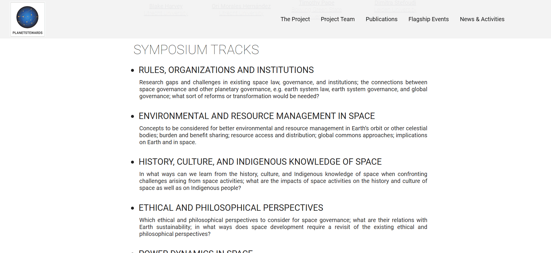
The brand visuals and website design were implemented with responsiveness and clarity in mind. The result was a friendly, structured site that clearly communicated the program's mission. Feedback highlighted the logo’s warmth and simplicity, as well as the site’s clean, engaging layout. The platform now serves as both an informational hub and a launch point for community action.